11 iconic real estate logos + Tips to design (or refine) yours
Is your real estate logo “good enough” for your brand? Before you answer, consider this: Your logo speaks for you when you’re not in the room. What is it saying about you? What should it say about you? A “good enough” logo will look nice on your business card. An exceptional logo can help you tell your story persuasively enough to build an iconic brand.
To help inspire you to design (or refine) your logo, we curated this list of 11 real estate logos that helped build iconic brands. They run the gamut from solo agents to tiny but mighty boutique brokerages to multi-billion dollar franchises. For each logo, we provide actionable takeaways you can use to create your own standout branding. We wrap up with six critical rules all exceptional logos follow and tips to make the design process easier.
11 remarkable real estate logos that helped build iconic real estate brands
1. The Volpe Team
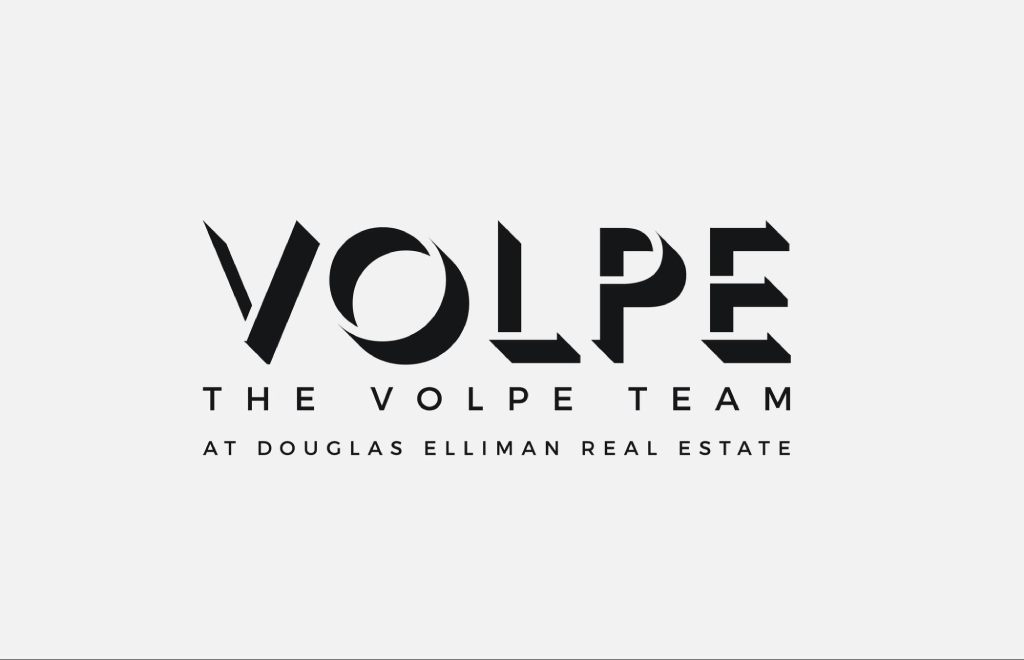
Timeless, cool and confident, The Volpe Team’s logo is an ideal reflection of their tony Brooklyn farm area. Most of the homes they sell are snapped up by investment bankers these days, but this “cool kid” logo helps them sell the fast-fading dream of bohemian Brooklyn.
Why it sells
Their logo is just the right amount of trendy to help sell the dream of living in brownstone Brooklyn. It’s simple enough to work as a tiny icon on social media or printed on a 50-foot-wide billboard. It’s also versatile; the minimal black-and-white color scheme means it can work on any background.
2. Village Properties
Village Properties’ logo exudes the casual elegance of the highly sought-after Spanish Revival mansions they sell. Like the Volpe Team, they went with a dead simple logo. Two fonts, two words, and enough graphic gravitas to help them stand out in a hyper-competitive market.
Why it sells
Simplicity sells. This logo evokes one of their city’s most prized home styles with just a typeface (Think 1920s Hollywood). There are untold thousands of high-quality typefaces to choose from. They managed to find THE font that helps show off their local roots and sell their brand. It even holds its own next to the Forbes Global Properties logo. Swipe left on the logo above to see them side-by-side.
3. Jack Conway
Bringing an almost 70-year-old brand into the future isn’t easy — kicking and screaming is virtually guaranteed. Jack Conway and creative firm 1000 Watt made it look easy. The brokerage’s logo leverages a simple but futuristic typeface and bright, bold colors that place the brand firmly in the 2020s. The “EST. 1956” tagline helps reassure old-timers and new clients alike of the brand’s storied past.
Why it sells
Taking strategic risks with your logo can sometimes lead to big rewards. This logo is dead simple; a well-chosen typeface, bold colors and a dash of credibility is sometimes all you need. It’s also versatile; the fire-engine-red brand color exudes passion, confidence and boldness. The white version can tone things down when the situation calls for it.
4. Tristan Ahumada
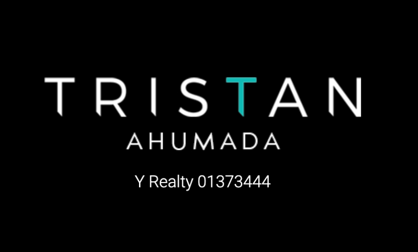
California Realtor and Lab Coat Agents co-founder Tristan Ahumada’s logo is like confidence in a jar. The all-caps sans serif typeface has just the right amount of sharp edges to look cool without sacrificing trustworthiness. Much harder than it looks!
Why it sells
The logo’s fresh, modern design straddles the fine line between selling real estate and selling marketing software — two worlds in which Tristan thrives. The turquoise “T” screams Southern California and works perfectly as a simple one-letter monogram on his website and business cards.
5. Kumara Wilcoxon
Austin Realtor Kumara Wilcoxon went the Cher route with her logo and personal brand. It’s simple, elegant and oozes luxury — perfect for selling upscale homes in the new crypto capital of America. It’s also timeless enough to appeal to older buyers and sellers who probably think ETH is short for Ethan Allen. (Hint: it’s the stock ticker for Ethereum, a wildly popular cryptocurrency.)
Why it sells
This logo works for three reasons: the font, the font and the font. This typeface is sleek, chic and simple without being too minimal. It also wouldn’t look out of place on the label of a $1,000 luxury sweater. This helps Kumara appeal to the fastest-rising demographic of new buyers in Austin and across the country: single women — a shrewd branding decision for any Realtor. NAR data show single women bought 19% of new homes in 2023 (PDF), and that trendline is rising.
6. Brown Harris Stevens
Bold. Honest. Smart. Brown Harris Steven’s logo is another rebrand that brought a 100+-year-old brokerage into the 21st century. It’s clean, simple and works spelled out or as a three-letter monogram: BHS. Their logo has gone through countless iterations since 1873(!), when the brokerage was founded, but this version is the clear favorite for our team.
Why it sells
Simplicity sells. Like all of the best real estate logos, it conveys its brand message clearly and efficiently. The double meaning of BHS also helps associate their logo with their company values: boldness, honesty and market intelligence. That’s a lot of heavy lifting from a text-only logo!
7. The Hudson Advisory Team
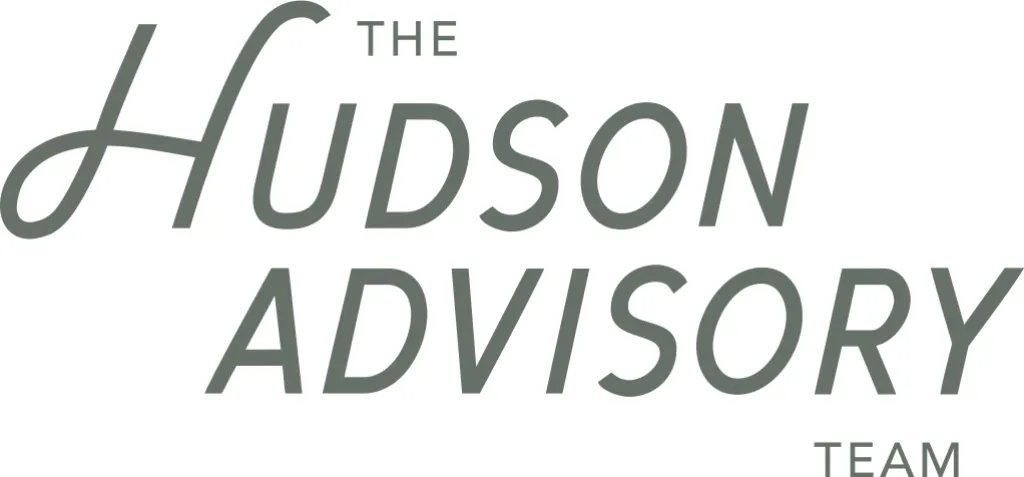
The Hudson Advisory Team in New York City also uses a simple text-only logo (known as a wordmark). It looks historic yet modern — ideal for helping them sell turn-of-the-century loft conversions and other contemporary yet historic properties in their city.
Why it sells
This logo is a nod to old-school New York City, without looking dated or derivative. It also resonates with their target demographic: New Yorkers (or wannabe New Yorkers) who are nostalgic about classic logos like New York Magazine’s — myself included.
8. Jade Mills Estates
Signed, sealed and sold. Jade Mills’ logo leverages her autograph-worthy signature to help associate her brand with the celebrities she sells homes to. While we can’t confirm this is her actual signature, it helps add a personal touch to her branding.
Why it sells
Buying or selling a home is stressful. People want to work with a human being they can relate to, not a market-researched brand. This logo helps Jade sell herself along with her services. It’s also just good marketing. A Harvard study found that making even a small emotional connection with your customers can lead to double-digit growth.
Recent Posts





GET MORE INFORMATION
